This is a quite a short, simple and succinct oil pastel project aimed at teaching a few essential oil pastel skills such as layering, blending, colour matching and monoprinting. The theme of this scheme of work is food – which is ideal for engaging students.
I always find that students love the experience of using oil pastels and how rewarding they can be as a medium (when done properly!)
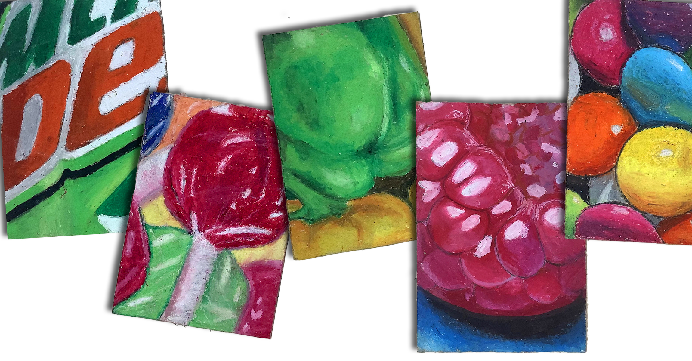
I have previously shared a more abstract oil pastel art project inspired by plants and flowers, but this one is a bit more challenging and aimed at older students – I taught it with Year 9 students here in the UK and I’m loving how well they all turned out.
If you don’t want to teach this with Year 9, it could easily be used with GCSE art classes, or with younger students if they work a little bit bigger. This work is A6 size.
🎨 Get the resources for this project on TES or TPT 👍
Considering this project involves teaching a range of techniques (and oil pastels can be quite messy), I was really pleased with the work that students made. Some of the pieces are absolutely beautiful and students have told me that although it was ‘messy’, they really liked being able to blend the pastels and learn how to use them properly – yay! 🙌 Students have also said they liked the immediacy of using the pastels (not in those words obviously) and were impressed with how quickly their pieces started to look realistic.
Why food? Why oil pastels?
All of the projects I teach in Year 9 are based around food – mainly because it engages students and the wrappers and reference pictures are instantly recognisable. However it’s also great for motivation… a packet of biscuits or a few lollipops as a reward for Y9 students really helps to keep them on side when behaviour can be challenging… 😆
I chose to use oil pastels as they are relatively quick to work with and give instant gratification due to their rich and intense colours.
They are wonderful for adding highlights and shadows so students can see their work starting to look realistic quite early on.
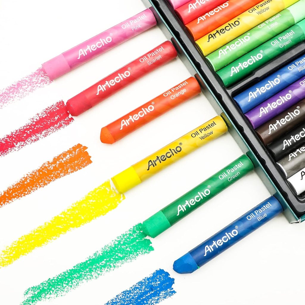
💡 We have used this Artecho brand of oil pastels and found them to be excellent quality. To save money and make them go further, I snap the pastels (or get a student to) then put a mix of different colours into plastic wallets for students to use on their tables. This essentially doubles the amount of pastels in the box.
How to use oil pastels?
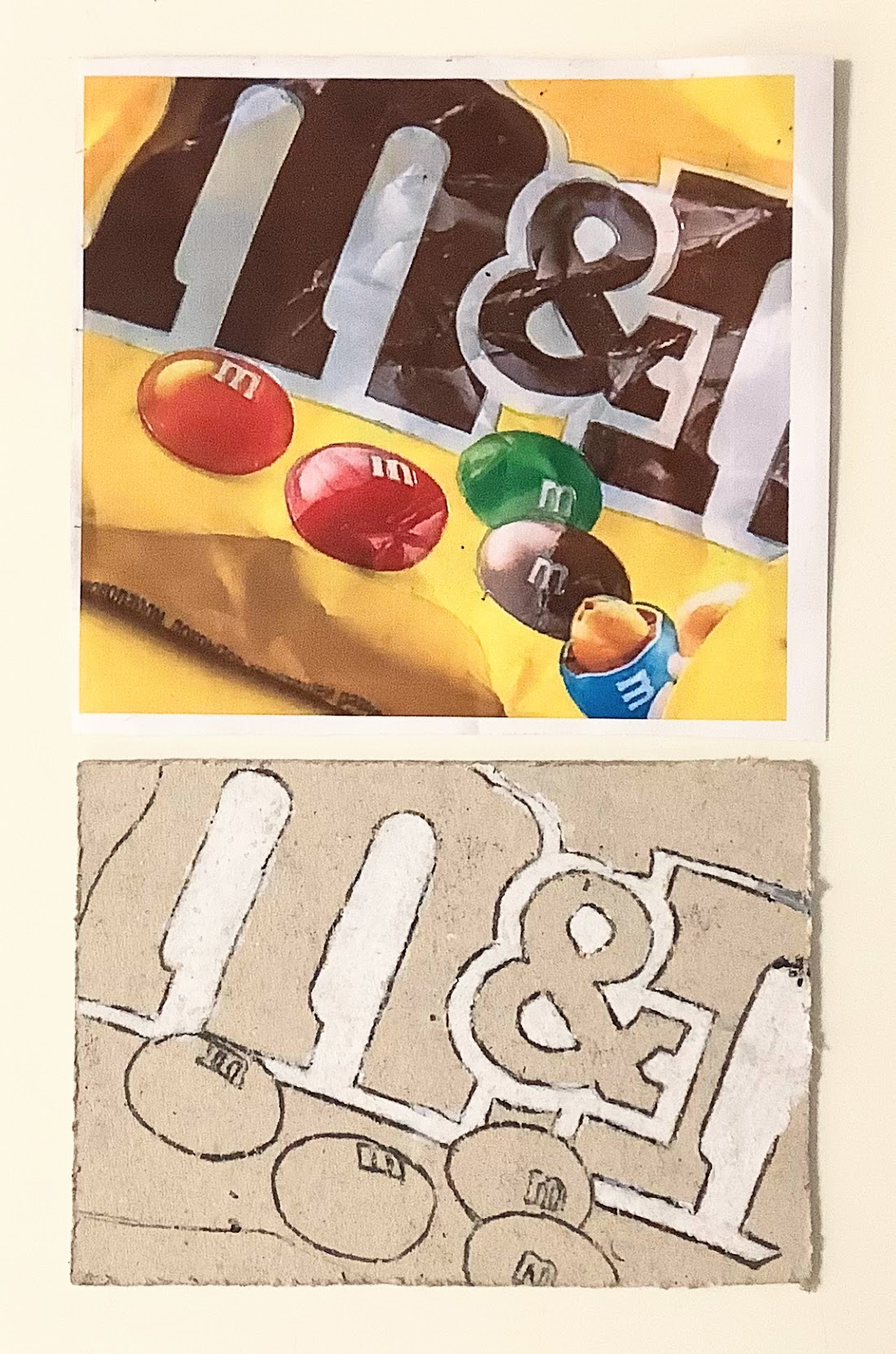
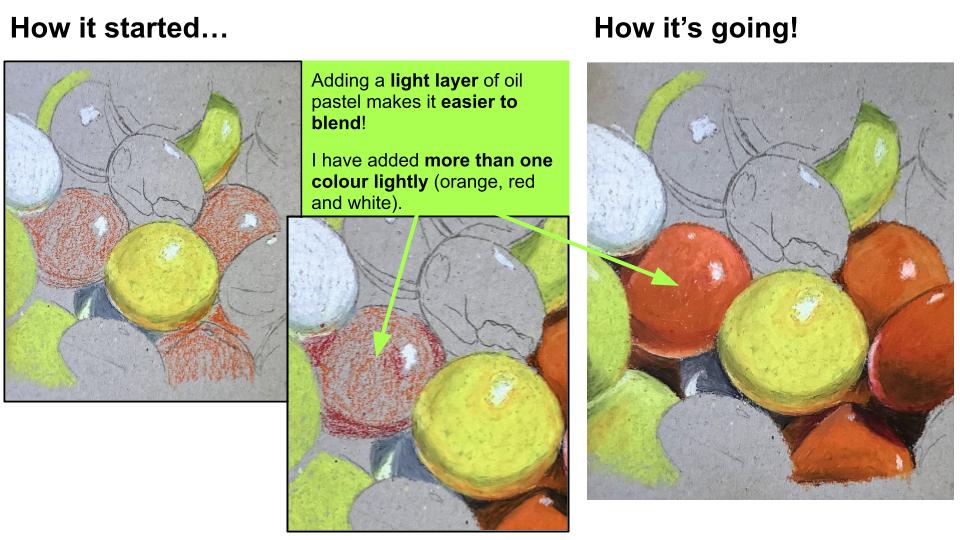
The first lessons in this oil pastel project start with the absolute basics for students. Lesson 1 teaches students how to monoprint their reference image using a dark coloured oil pastel. Students need to trace all of the details they can see on their reference image, including differences in shadows and highlights.
I did this to ensure students were really looking at the image and all of the tiny details that make it look realistic. We worked onto board rather than paper – all of the resources needed are listed in the presentation.
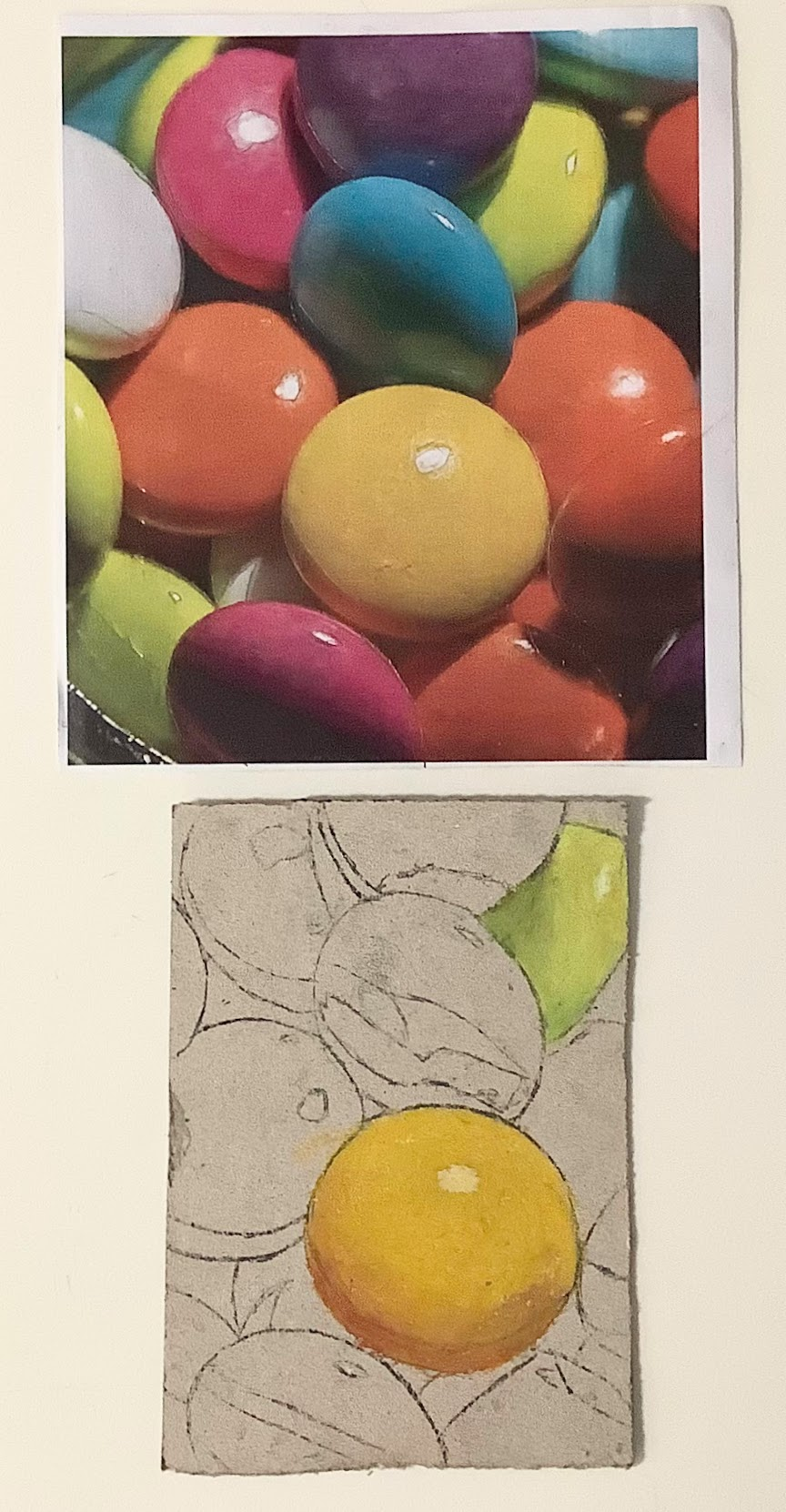
At the end of lesson 1 and in lesson 2, students start to add the lightest colours and carefully colour-match by practising on the back of their work. Here are a few examples of student work after the first and second lesson: monoprinting and lightest colours.
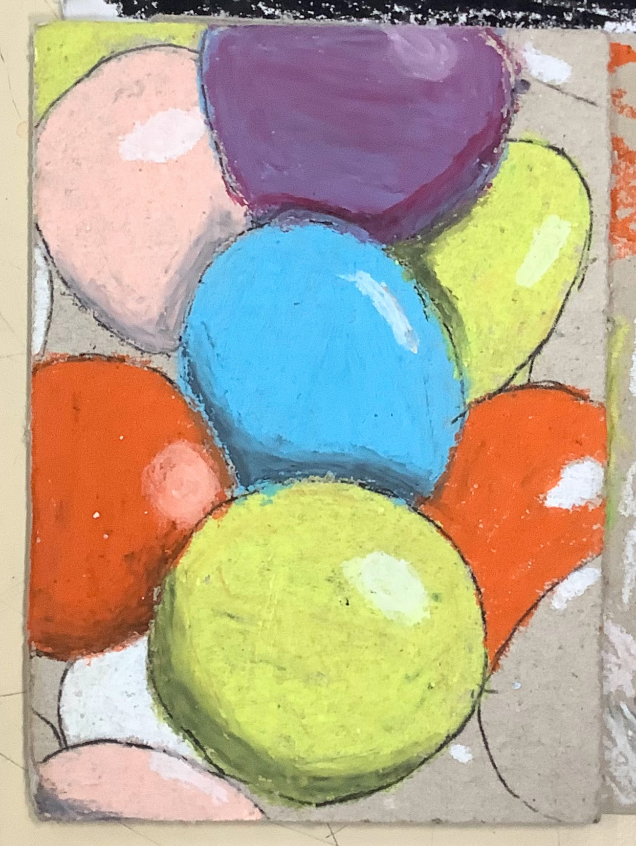
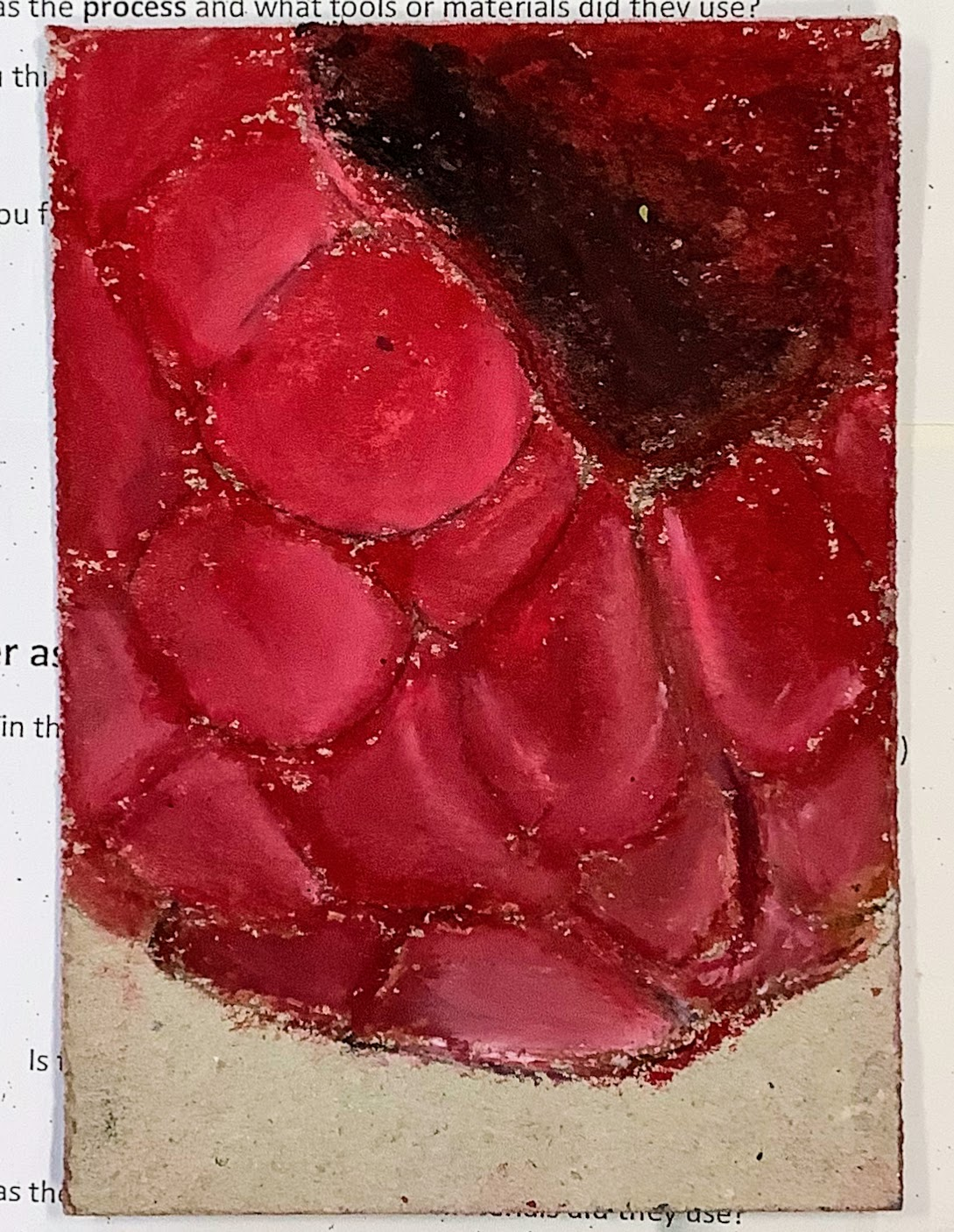
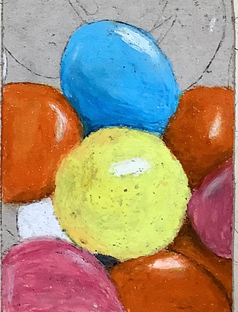
Throughout this unit of work I’ve included examples of student work at each stage, as well as my own examples to show students the next steps.
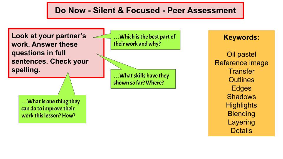
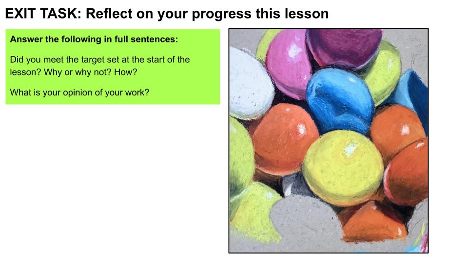
All of the lessons have a ‘do now’ task which is related to improving, reflecting on progress or assessing the work they have done so far.
Get art resources sent straight to your email:
🎨 Get the resources for this project on TES or TPT 👍
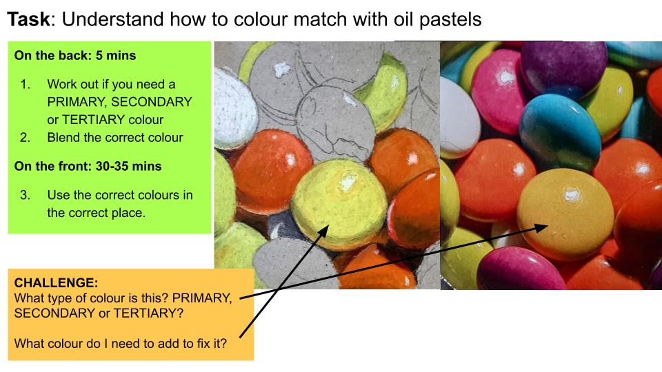
Lesson 3 focuses on colour matching and having students identify primary, secondary or tertiary colours in their reference picture. In my demos, I show students how to press on lightly with the oil pastels and move them in a circular motion to warm the oils up and help them blend.
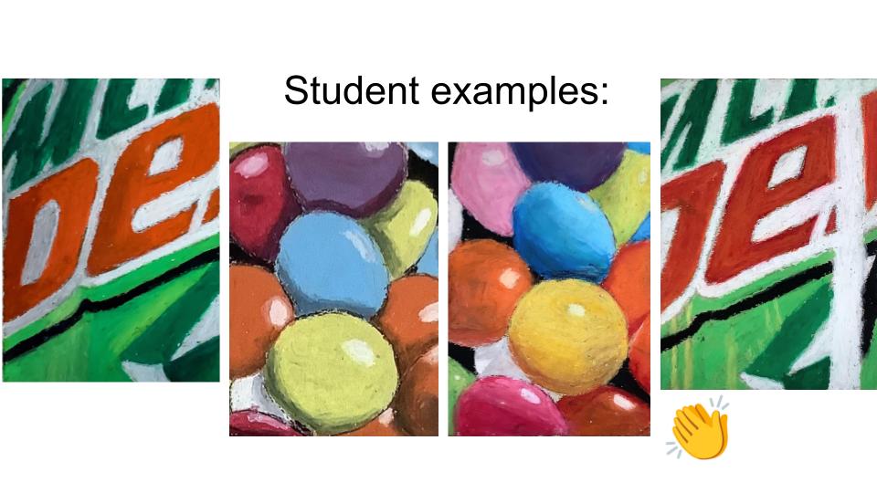
Since students started with light colours, it made it easier to blend darker shades over the top. Throughout the lessons I am reminding students about rotating the oil pastels and use the flat, sharp edge when they want accurate outlines and edges. Here are a couple of examples of work after lesson 2:
In Lesson 4, students start to refine their work. By now they should understand how to use the oil pastels and how to colour match. Lessons 4 and 5 can be repeated as often as needed until students complete their work.
These last lessons are about adding shadows, highlights and refining the edges or shapes to make them clear. The ‘Do Now’ tasks for these lessons are for students to set their own challenging targets for the lesson (since they’re all up to different places and have different parts to complete).
The reflection tasks for the lessons also link back to the start of the lessons:
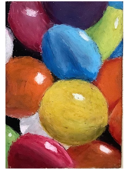
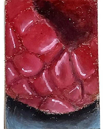
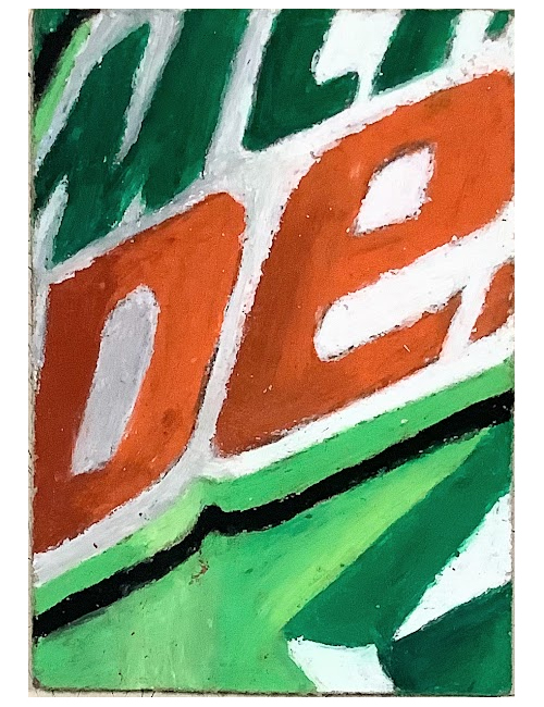
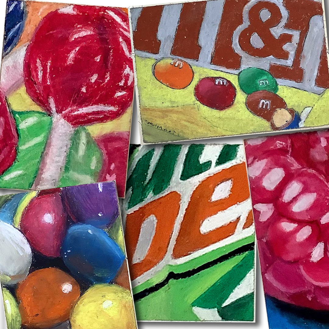
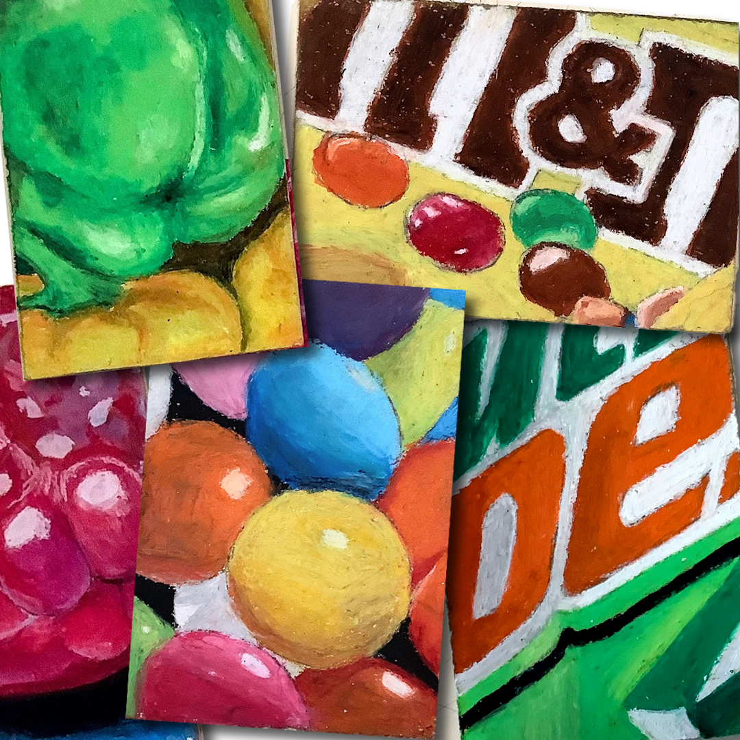
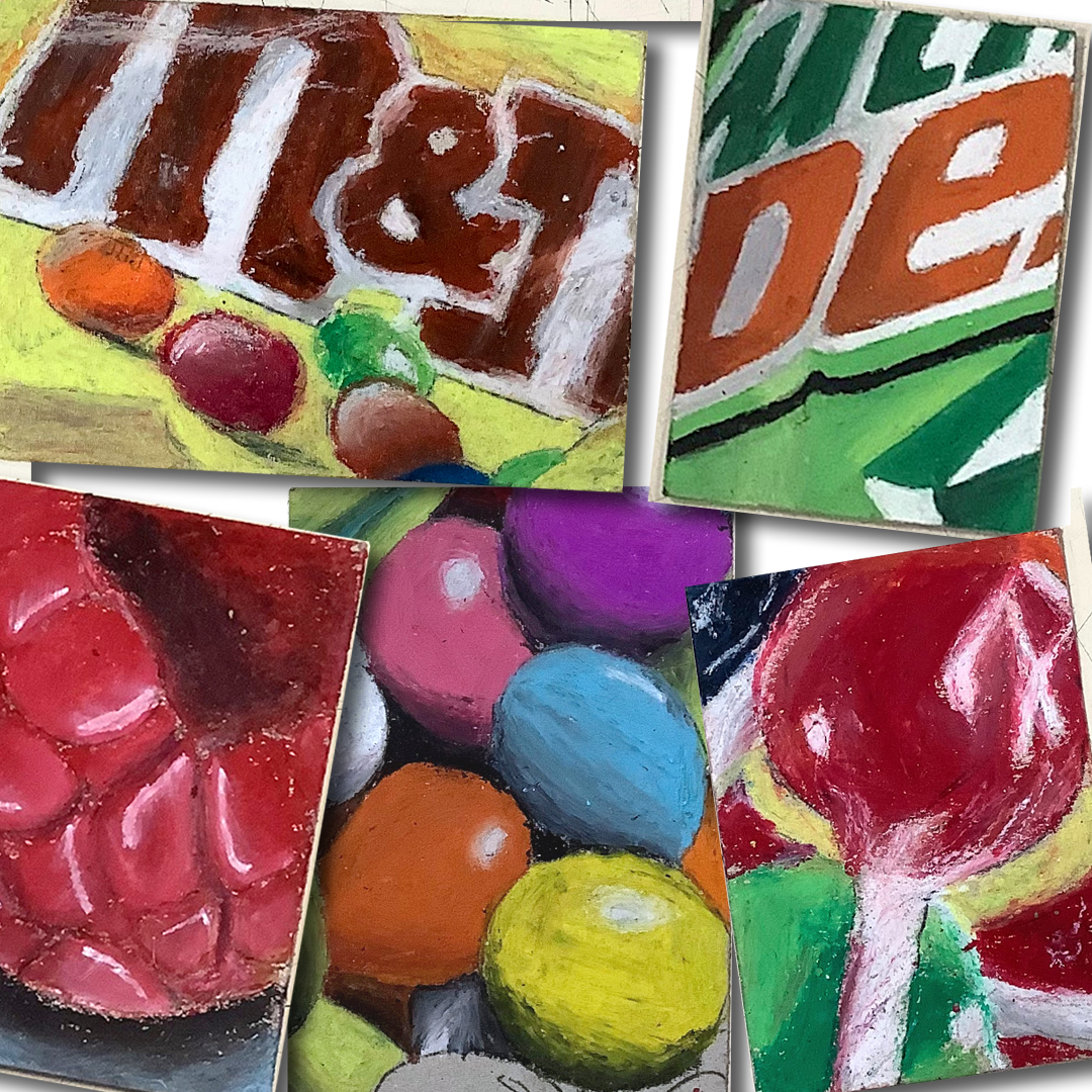
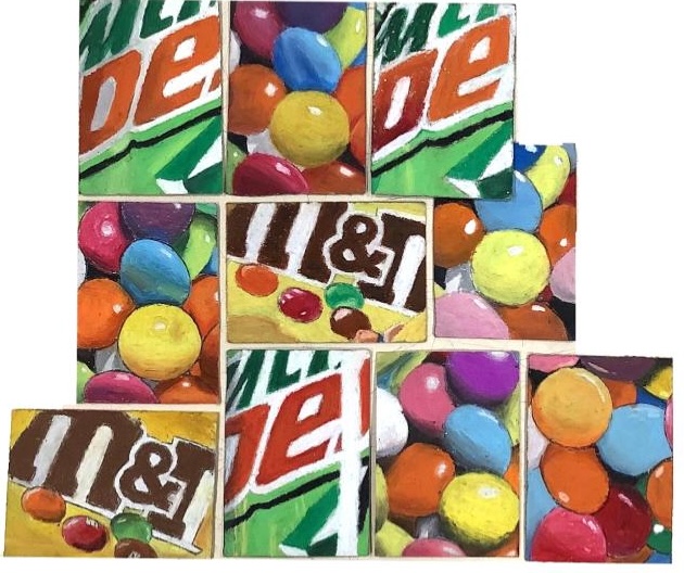
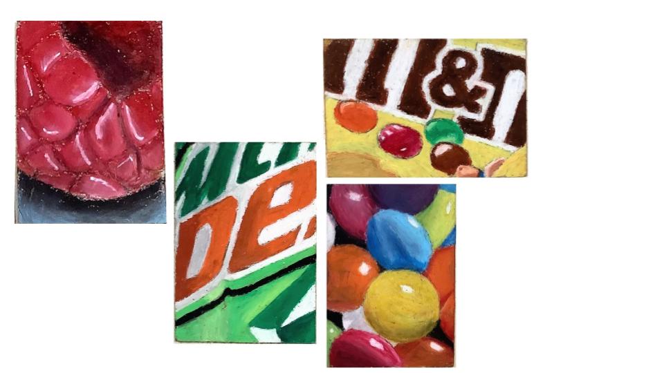
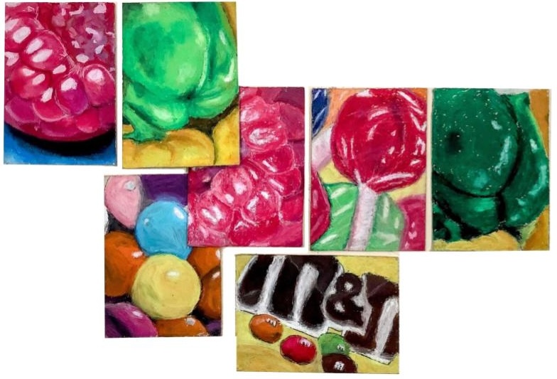
Since the students had a choice of reference pictures, there were a whole range of outcomes and I was so happy with how they have turned out! I think students applied their learning of layering, blending and colour matching to a really high standard – plus they loved their work too 😊
😍 🎨 What do you think of their work?
Tips for teaching oil pastels:
- I had students work onto board instead of paper
- Students can clean the pastels on the back of their boards
- Have mixed colours of oil pastels in plastic wallets for students to share on their tables
- I cut up wet wipes into strips (or had a student do it) and gave these out at the end of the lesson to clean hands
- Made sure to give jobs out for students at the end of lessons to collect pastels that had fallen onto the floor
