This is my third lesson from my GCSE Landscape Painting Project. After our introduction to mark-making using watercolours in lesson 2, we moved on to looking at Pointillism as a technique (one of my favourites) 😊 For this lesson I introduced new artists to look at then set out the objectives. Students ended up producing some excellent Pointillist painting studies!
For this painting project, I wanted students to research a range of artists and their approaches to texture, movement and mark-making with paint. I wanted students to start painting as quickly as possible, so didn’t really dive into the fascinating history of pointillism.
For this pointillism lesson I chose three artists as a reference and let students choose which one(s) to research. In the resources I included some keywords for pupils to focus on and asked students to print out high quality pictures of their work – some full size and some cropped to close up. Most of my students don’t have a printer at home so we did this in class.
Pointillism Artists
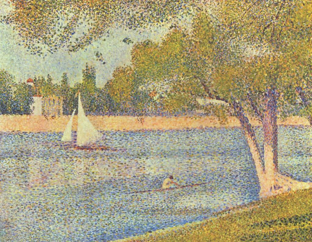
Georges Seurat (traditional, landscape)
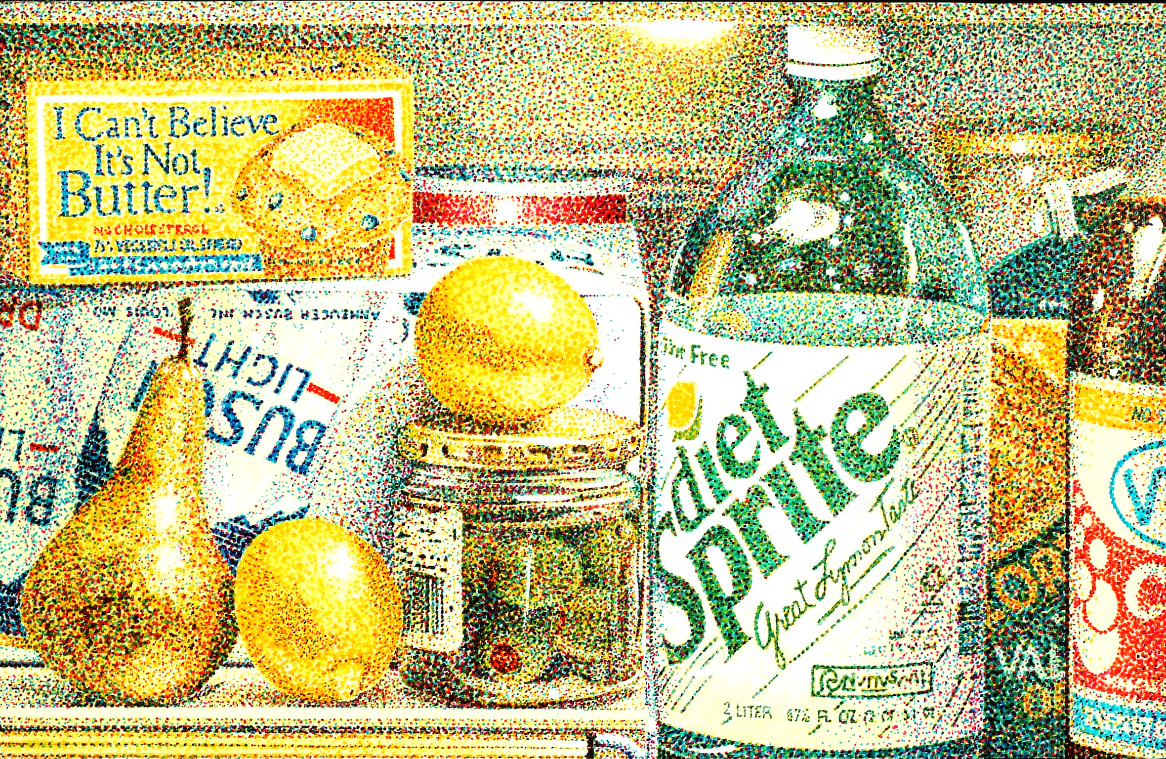
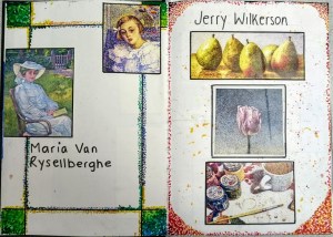
Jerry Wilkerson (modern, still life, pop art)
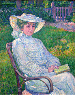
Maria van Rysselberghe (traditional, female, portraiture)
I love how well the students responded to these artists – here are some of their sketchbook pages:
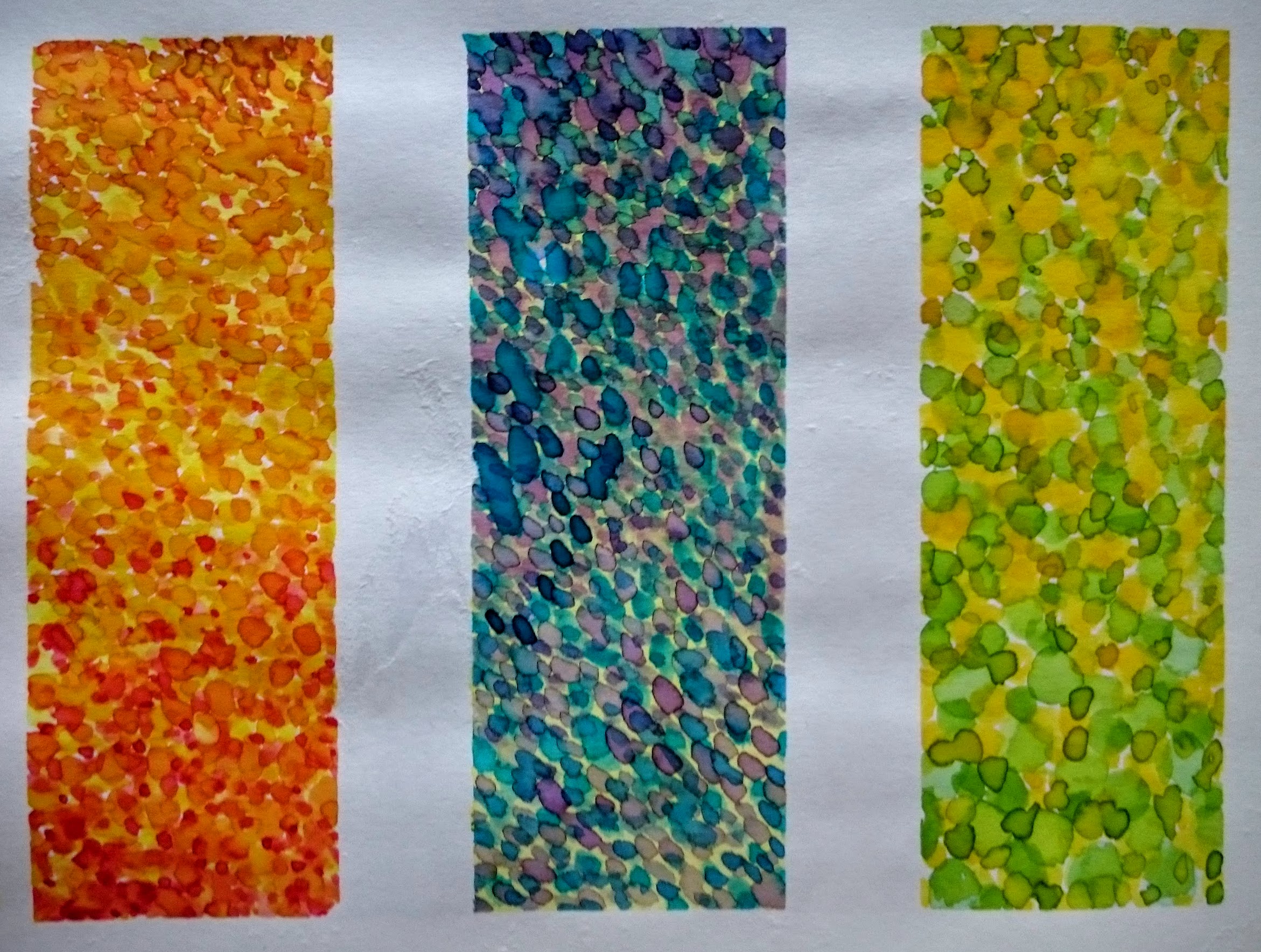
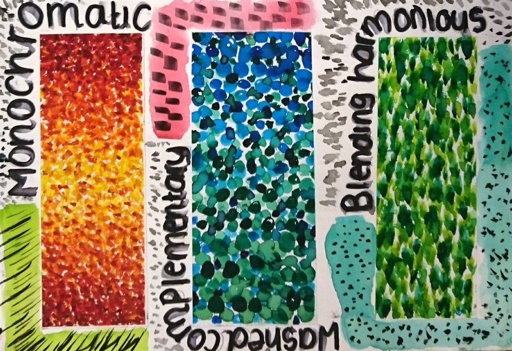
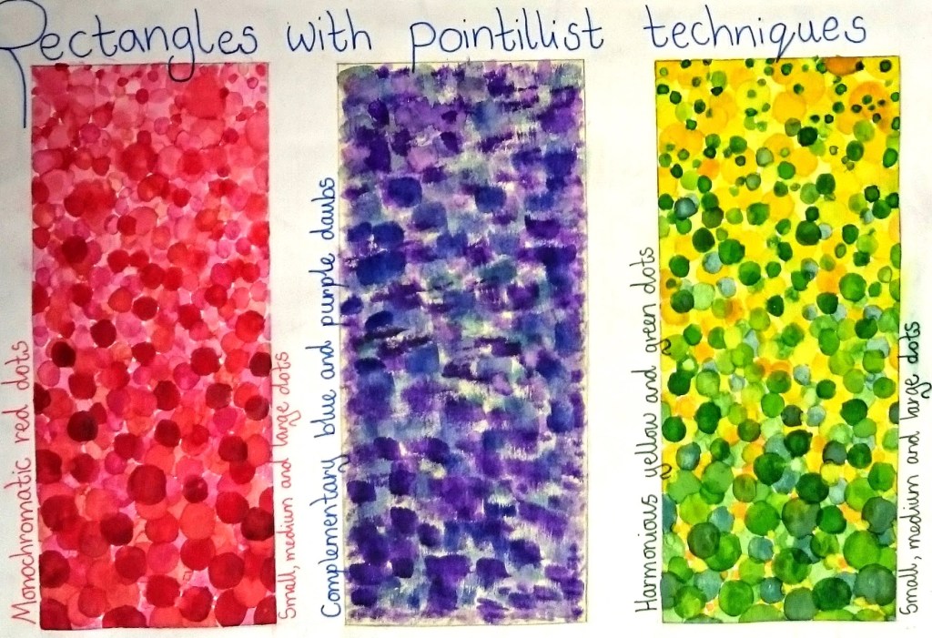
The aim was to use watercolours to create three pointillist studies:
- one monochromatic (all the tones of one colour)
- one blending two harmonious colours
- one painting over a light washed background with a contrasting colour (using different size and shaped brushes to create daubs rather than dots)
I started by selecting a small round brush, painting large circles at the top of the rectangle quite close together. As I moved towards the bottom, the circles became smaller and further apart. Where I blended two colours together (as in the rectangle on the right with yellow and green paint), I used the same method from top to bottom, then bottom to top with the next colour.

The study in the middle was created by first painting a light wash in the background, then choosing a complementary colour to daub over the top. On each study I aimed to fill all of the white space and this was important to get across to pupils as some tried to use the white of the paper to create ‘lightness’ instead of painting it in. To keep my presentation sharp I masked off the areas on my page before I started painting.
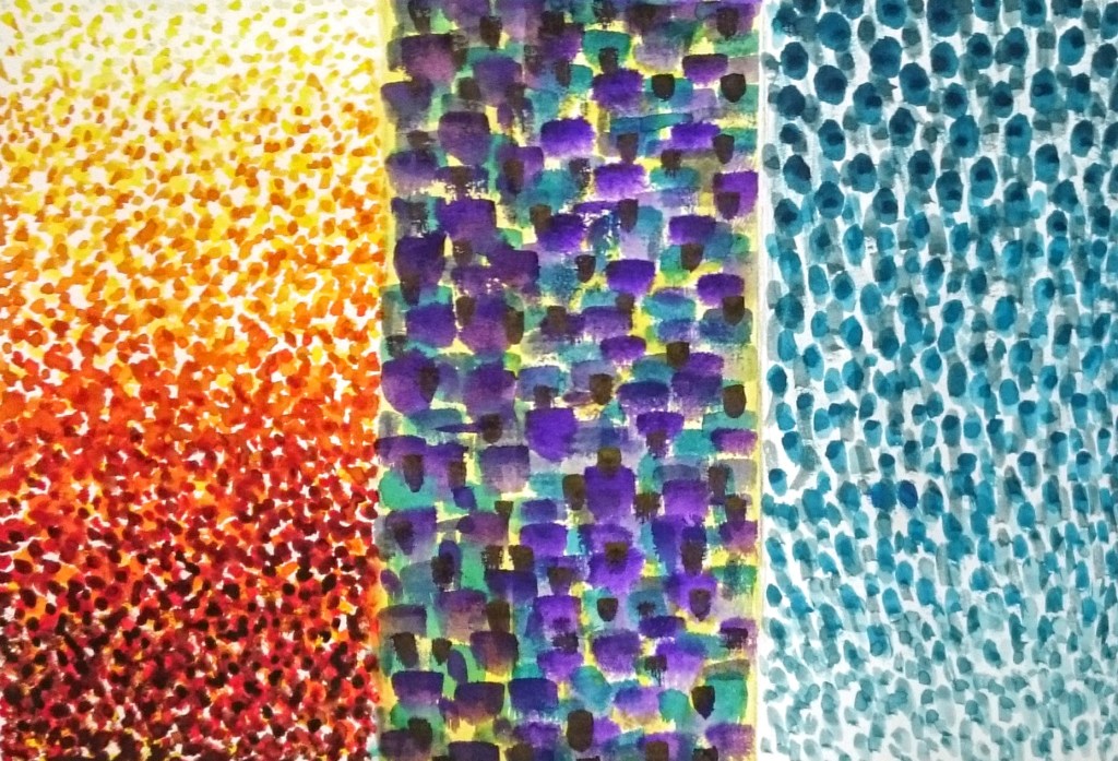
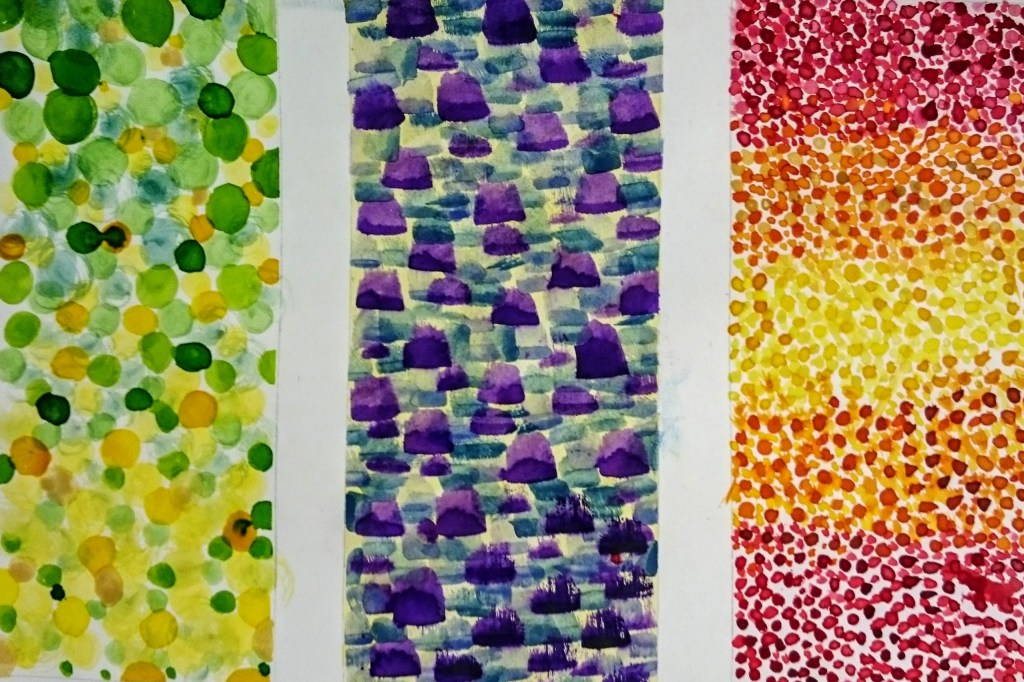
Here are some examples from the pupils, I think they did brilliantly!
What do you think of this painting lesson and the student’s work? Have any questions? Let me know in the comments.




3 thoughts on “KS4 Art & Design: Mark Making [Lesson 3]”